There’s a moment when people walk into a space and immediately “get” the brand—the light, the color, the vibe. That moment isn’t accidental; it’s designed. In this article, we’ll show you how to use LED neon to shape that instant impression, from color psychology and sizing to placement and install basics. Our goal is to help you choose, place, and care for EYE CATCHING LED NEON SIGNS so your office, store, or event feels unmistakably yours.
In this article, you’ll learn why LED neon outperforms old-school glass neon for modern brands, how to pick the right size and font for legibility, which colors communicate your message at a glance, and where to mount signs for maximum visibility and photo-friendly moments. You’ll also get real-world layout formulas for reception areas, mission walls, product bays, and pop-up events—plus maintenance and safety tips to keep your glow pristine.
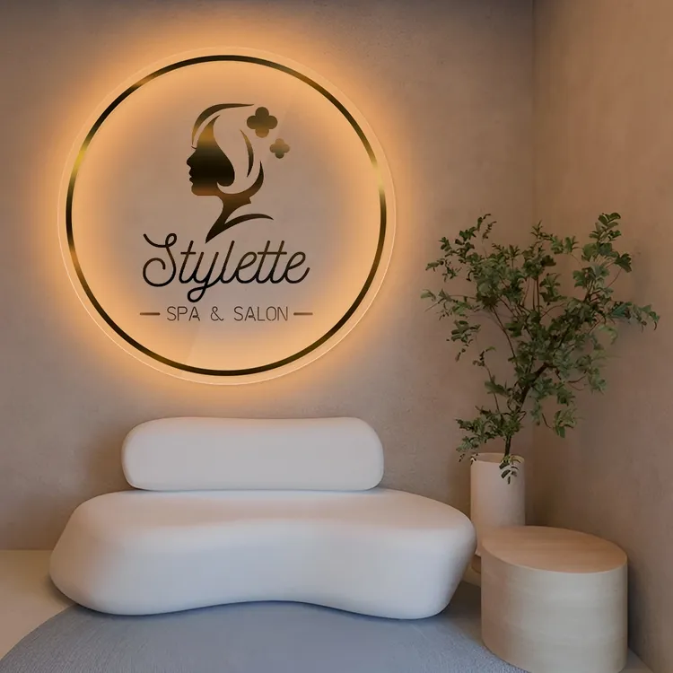
Shop EYE CATCHING LED NEON SIGNS
Why LED Neon Wins for Modern Spaces
LED neon is a design trifecta: bold color, low heat, and energy efficiency. Compared with traditional gas neon, today’s LED-tech runs cooler and uses less power, so it’s better for long hours and varied settings—from a quiet podcast studio to a busy retail entry. For brand teams, the practical upside is huge: consistent brightness across colors, safer handling, and more manageable installation on typical office or retail walls. In short, EYE CATCHING LED NEON SIGNS deliver the “wow” factor with day-to-day reliability.
Color Psychology: Say It with Light
Color speaks before words do. Here’s a quick translation guide to shape your palette:
- Warm White / Soft White: Clean, editorial, timeless. Ideal for mission statements and logos that must read across seasons.
- Ice Blue / Electric Blue: Modern, tech-forward, crisp. Perfect for startups, wellness, and future-facing brands.
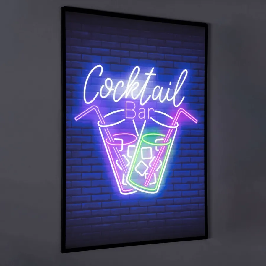
- Neon Pink / Magenta: Playful, bold, social-media magnetic—great for selfie zones and product launches.
- Citrus Yellow / Amber: Optimistic and high-visibility; pulls eyes from a distance without feeling aggressive.
- Green / Mint: Freshness, sustainability, growth narratives—nice for plant-centric interiors or health brands.
- Red: Urgent, celebratory, dramatic. Use for accent statements or short phrases that benefit from punch.
Blend two tones when you want hierarchy: a neutral (warm white) for copy and a brand color for emphasis. With EYE CATCHING LED NEON SIGNS, dual-tone concepts can turn any wall into a focal point—think “logo in white” with a tagline in your signature hue.
Shop EYE CATCHING LED NEON SIGNS
Sizing & Legibility: Make It Read in Real Life
Neon that looks great on a mood board still has to read across a room. Use this simple sizing heuristic:
- Reading distance ≈ 10× letter height. If you expect people to read from ~15 feet, aim for ~1.5″–2″ letter height minimum, larger for scripts.
- Block vs. Script fonts: Block fonts read smaller; scripts need more height to avoid visual “mush.”
- Line length: Keep phrases punchy. Two lines with a balanced rag (similar line lengths) look intentional and photograph well.
For logo marks, measure the core symbol from its widest point and ensure adequate negative space around the sign. EYE CATCHING LED NEON SIGNS pop most when they’re not crowded by shelves or frames.
Placement That Converts: Where Light Meets Behavior
Before drilling a single hole, map foot traffic and sightlines:
- Reception Wall: Place the sign centered at eye level (roughly 60″–66″ from floor to center), flanked by plants or textural panels. This becomes your “first glance” brand signature.
- Retail Entry / Window: Angle slightly toward the sidewalk so passersby catch a clean read. Mount 12″–18″ behind glass to reduce glare.
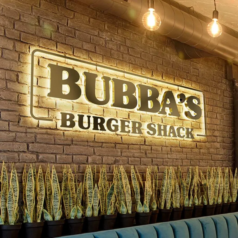
- Mission Wall (Office): Pair a maxims or taglines in warm white with your brand icon in color—motivation meets identity.
- Product Bay / Feature End Cap: Use a short, action-forward phrase (“TRY IT,” “NEW DROP”) to guide attention where you want it.
- Photo Nook / Event Backdrop: Choose a punchy phrase and allow 3–4 feet of standing distance for people + camera. Add a textural backdrop (hedge wall, wood slats) for depth.
The rule: put EYE CATCHING LED NEON SIGNS where decisions happen—entries, points of sale, demo zones, and selfie-friendly corners that feed your social pipeline.
Installation Basics: Simple, Safe, Repeatable
Most LED neon signs arrive with pre-drilled acrylic backers and standoff mounts, so install is refreshingly approachable. A quick blueprint:
- Template & Level: Tape up a paper template, use a level, and mark anchor points.
- Anchors for the Wall Type: Drywall anchors for gypsum; masonry anchors for brick or concrete.
- Power Path: Plan a clean cable route. If possible, align signage near an outlet and conceal with cable channels or furniture.
- Dimmers & Remotes: Add a dimmer switch for mood shifts from day to evening.
- Team of Two: Signs are lightweight but wide—two sets of hands keep edges safe.
Once mounted, EYE CATCHING LED NEON SIGNS become set-and-forget: switch on for business hours, dim for ambient evening glow.
Shop EYE CATCHING LED NEON SIGNS
The Only Checklist You Need (Bullets + Guidance)
Use this hybrid guide to go from idea to wall-ready fast:
- Define the Moment: Is this a brand statement, a directional cue, or a photo magnet? Your message determines size and color.
- Pick the Palette: Anchor with warm white for readability; layer your signature brand color for emphasis.
- Measure the Wall: Confirm width and standing distance; let the sign breathe with 6″–12″ margins.
- Choose the Mount: Standoffs create dimensional shadow; flush mount feels minimalist.
- Plan the Power: Decide on dimmer or remote; align with outlet and conceal cords early.
- Preview at Scale: Print the phrase on paper at scale or mock up painter’s tape to validate line breaks and size.
- Photograph the Mock: Check legibility on your phone—the same way your audience will.
Dial these steps in, and your EYE CATCHING LED NEON SIGNS will feel inevitable, not improvised.
Brand Storytelling with Typography & Shape
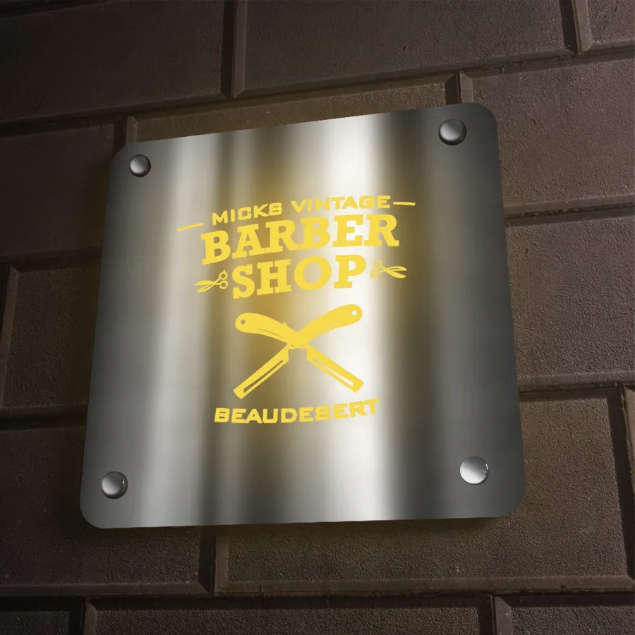
Typography is your voice in light. Sans-serifs read modern and crisp; serif or script communicates character and warmth. Keep stroke widths balanced to the LED’s glow path—too thin and you lose intensity, too thick and you lose elegance. For logos, consider outline shapes (circles, badges) that frame the sign and echo packaging. With EYE CATCHING LED NEON SIGNS, an acrylic silhouette backer can double as brand framing, making installs cleaner on uneven surfaces.
Office Use Cases: Culture, Clarity, and Camera-Ready
- Values Wall: Set your top value in warm white, your logo in brand color. Add a dimmer so town-hall meetings feel theater-ready.
- Zoom Backgrounds: Smaller wordmarks mounted behind founders or team leads create consistent video presence.
- Project Rooms: A simple mantra (“BUILD BOLD,” “FOCUS MODE”) energizes sprints and celebrates launches.
When teams see values literally in lights, culture feels less abstract—and EYE CATCHING LED NEON SIGNS become a daily nudge toward the brand you’re building.
Retail Playbook: From Foot Traffic to Footage
Retail is theater. Neon is your spotlight. Put your sign where it can do three jobs at once:
- Stop Power: A bold color in the window or just inside the door invites a half-second pause—which is everything.
- Wayfinding: Use short verbs to point shoppers: “PAY HERE,” “TRY ME,” “NEW.”
- UGC Engine: A sharable phrase near product bays turns shoppers into creators; your feed gains organic reach with every snap.
Pair EYE CATCHING LED NEON SIGNS with mirrored or textured backdrops to double the glow and create depth on camera.
Shop EYE CATCHING LED NEON SIGNS
Events & Pop-Ups: Packable Impact
Temporary spaces need fast wins. LED neon excels here: lightweight, low-heat, and eye-catching from across a hall.
- Step-and-Repeat Upgrade: Swap a fabric banner for a neon phrase and your photos look editorial instantly.
- Booth Beacon: Mount high within your footprint for clear sightlines; dimmer on hand for venue lighting changes.
- After-Event Life: Reuse the piece in your HQ lobby or showroom wall—it pays off long after the event.
Maintenance & Care: Keep the Glow Gorgeous
LED neon is low maintenance by design. A soft microfiber wipe removes dust; avoid harsh chemicals. Periodically check standoffs for firmness and inspect cords near high-traffic areas. If you add a timer or smart plug, you’ll maintain consistent on/off schedules, extending the life of your EYE CATCHING LED NEON SIGNS without daily manual toggles.
Budgeting & ROI: The Practical Math of Glow
Think in cost-per-impression. A sign that runs daily for a year pays for itself through awareness alone—but it also generates content moments (stories, reels, event photos). Choose phrases that stay relevant (brand name, evergreen tagline) to maximize lifespan. For multi-location brands, standardize color and size so every new EYE CATCHING LED NEON SIGNS install strengthens recognition.
Troubleshooting: Clarity Beats Complexity
If something feels “off,” simplify:
- Unreadable Script? Increase letter height or switch to a balanced sans with a hint of personality.
- Color Clash? Anchor copy in warm white, reserve your brand color for a single word or icon.
- Too Busy Wall? Remove competing frames, add breathing room, and reduce line count.
When in doubt, test with painter’s tape outlines and shoot a phone photo from typical viewing distance. Your camera will reveal legibility issues instantly.
Conclusion
LED neon is more than a trend; it’s a precise tool for shaping how people feel in your space. Choose colors that communicate your message before you say a word. Size for legibility where decisions happen. Place signs to intercept attention, guide behavior, and invite shareable moments. And keep install, power, and care simple so your glow is consistent from open to close. When you approach signage as brand strategy—not just decoration—EYE CATCHING LED NEON SIGNS become your most hard-working design element: magnetic at first sight and memorable long after.
Shop EYE CATCHING LED NEON SIGNS
FAQ
- What size LED neon sign should I choose for a reception wall?
Measure viewing distance and apply the 10× rule (letter height ×10 ≈ readable distance). For a 15-foot read, aim for 1.5″–2″ letters minimum; scripts need larger sizing. - Which colors photograph best indoors?
Warm white for copy plus one saturated brand color is a safe, high-impact combo. Blues and pinks pop on camera; yellow is great for visibility without harshness. - Can I install the sign myself?
Yes—most EYE CATCHING LED NEON SIGNS ship with pre-drilled backers and standoffs. Use proper anchors for your wall type, plan cable concealment, and have two people for mounting. - How do I manage brightness for different times of day?
Add a dimmer or remote. Keep higher brightness for daylight, then dial down in the evening to maintain ambiance without glare. - What’s the best place in a retail store for conversion?
Entry areas, near new arrivals, and at point-of-sale. Short, action-led phrases (“NEW,” “PAY HERE”) guide behavior and reduce friction. - How should I clean and maintain LED neon?
Use a soft microfiber cloth; avoid solvents. Periodically check standoffs and cord paths. A timer or smart plug keeps schedules consistent. - Can I reuse a sign across events and in the office later?
Absolutely. Lightweight builds and low heat make transport and remounts straightforward. Reusing extends ROI and keeps visual identity consistent. - What if my brand uses a script logo—will it read?
Yes, with correct sizing. Increase letter height and spacing, or pair a script logo with a block-font tagline for clarity at distance.